Templates / Tags /
Tooltips

Tooltip templates that deliver the right message
at the right time

No more “meh” tooltips. These templates are built to drive adoption, reduce confusion, and guide users at exactly the right moment.
🍯 Feeling stuck?
Here's a quick explainer about what this is
Feature explanation tooltip template
Guide users to understand new or complex features by showing clear, concise explanations right where they need help, so they can learn without interrupting their workflow or leaving the page.
See Template
Get access to feature
Sorry, that's not part of your current plan. Upgrade your plan to unlock it.
Gated feature upsell tooltip template
Prompt users to upgrade their plan at the exact moment they try to use a premium feature by showing a helpful message and a clear upgrade button, making it easy for them to access more features.
See Template
What's that?
Click on it to get contextual help.
Interactive badge tooltip design template
Highlight a product feature and guide users with a two-line tooltip that appears next to the relevant element, helping them quickly understand its value and how to use it.
See Template
🎺 New feature alert!
Boost productivity and automate tasks with our new customizable feature!
New feature tooltip template
Announce new features directly in your product interface to help users quickly discover and start using them, guiding their attention with a clear message and a call-to-action button.
See Template
Start your journey here
You'll be a a pro in no time. Continue using the app for more micro-learnings.
Onboarding tooltip template
Guide new users through key features step-by-step, helping them quickly get started and build confidence, while offering both immediate action and the option to learn more at their own pace.
See Template
You found me!
Inform without obstructing by using hover tooltips.
Tooltip that appears on hover template
Show users helpful information when they hover over an element, giving them quick guidance without interrupting their workflow. Help users understand features or actions by displaying a clear heading and subheading in a non-intrusive tooltip.
See Template
Try this!
Try using the HelpBar to search and answer questions.
Tooltip with hotspot template
Guide users to discover and try key features, like the HelpBar, by drawing their attention with a subtle hotspot and providing a quick, helpful explanation without interrupting their workflow.
See Template

Tooltips are like seasoning: used well, they make your product pop. Used poorly, they leave a bad taste in everyone’s mouth.

They’re often dumped into products as a last-minute band-aid: floating awkwardly, triggered at the wrong time, or packed with copy that reads like a legal disclaimer. They frustrate users, clutter interfaces, and, worst of all, don’t actually help anyone do anything better.

But with a few tweaks, tooltips can be the quiet MVP of product growth.

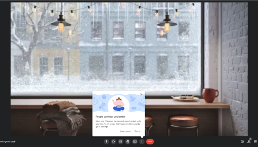
When designed intentionally, tooltips are one of the most powerful ways to deliver contextual guidance without interrupting the flow. They’re not onboarding tours. They’re not help docs. They’re quick, timely nudges that meet users exactly where they are, when they need them.

These tooltip templates are built for exactly that. Whether you’re looking to:

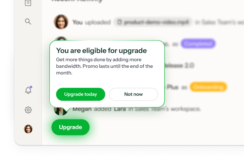
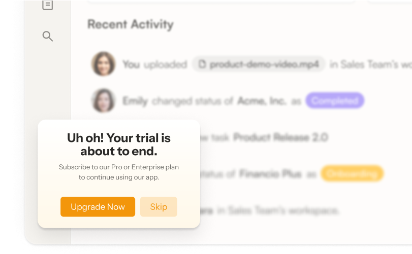
✅ Nudge users toward a premium feature they’re ready for

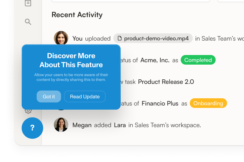
✅ Highlight a new or underused capability in a subtle, smart way

✅ Provide deeper education for advanced workflows or lesser-known value

…we’ve got patterns that work.

What makes a great tooltip?

We’ve seen thousands of tooltips. The best ones have a few things in common:

  • Trigger based on behavior, not page load. Nobody wants five tooltips screaming at them the moment a page loads. Smart tooltips appear when users do something that signals intent, like hover or click.

  • Keep it short and purposeful. If it takes more than a tweet to explain, it’s not a tooltip.

  • Design like it’s part of the product. Don’t make your tooltip look like it was duct-taped on. Match your brand and UI.

We’ve baked all of this into the templates on this page, so you’re not starting from scratch (or from some 2014-era UX blog).

Why use these tooltip templates?

Because you’re not just adding help bubbles—you’re improving activation, retention, and conversion. The right tooltip can:

  • Reduce confusion without bloating your UI

  • Encourage users to try premium features (hello, expansion revenue)

  • Help new users get to value faster

  • Empower advanced users to go deeper

Use these templates as plug-and-play starting points inside your product with Chameleon. Or remix them to fit your tone, triggers, and user journeys. Either way, you’re skipping the guesswork and giving your team a smarter way to build tooltips that actually work.

See real tooltips from top companies

What else can you do with tooltips?

0d482a1aa6634dcab51a1c19e13b4aa322a509f5ee4ae4a0ec88ae09598d392d.png

Upsell and Cross-Sell

Boost the lifetime value of your customers by leading them to unlock even more benefits with your product

View Use Case
14a9bd3d411b03762b4dcf4a27a38acb1fdca37441d8d801b4db28162dfd2649.png

Increase Feature Adoption

Make every feature release a successful one. Nudge users towards new, critical, or undiscovered features.

View Use Case
e871f5bd62da3226da468560c0186914baaa691c2f1ff988fd2e02bf70c3e69e.png

Better User Onboarding

Activate users more quickly with hyper-targeted onboarding flows tailored to their needs – and stay on brand while you do it

View Use Case
4.4 stars on G2

Create a Chameleon account to start using these tooltip templates

You’ll need a business email to get started