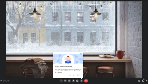
Google Meet's Tooltip
Google Meet’s new update filters out unwanted background noise, making sure your voice shines through...
Existing customer? Sign in
Highlight a product feature and guide users with a two-line tooltip that appears next to the relevant element, helping them quickly understand its value and how to use it.
Picture this: You've just shipped an incredible new feature that could transform how your users work, but three months later, adoption is sitting at a disappointing 12%. Sound familiar? The harsh reality is that even the most valuable features often go unnoticed in today's complex SaaS interfaces, buried beneath layers of navigation or hidden behind unfamiliar icons.
Interactive badge tooltips solve this feature discovery challenge by delivering contextual education exactly when and where users need it most. Unlike intrusive pop-ups or lengthy onboarding sequences, badge tooltips provide just-in-time information that guides users toward valuable features without disrupting their workflow. When implemented strategically, these contextual hints can dramatically improve feature adoption rates and accelerate user value realization.
Chameleon's interactive badge tooltip template transforms this concept into a powerful, no-code solution that product teams can deploy within minutes. With advanced targeting capabilities and seamless integration across your product education ecosystem, you can create personalized discovery experiences that feel natural and helpful rather than pushy or overwhelming.
An interactive badge tooltip is a contextual UI element that combines a subtle visual indicator (the badge) with an expandable information panel (the tooltip) to provide just-in-time product education. Think of it as a smart sticky note that appears exactly when users might benefit from learning about a specific feature or capability.
Visually, badge tooltips consist of a small, attention-grabbing indicator—often a colored dot, number, or icon—positioned near relevant interface elements. When users hover over or click the badge, an elegant tooltip expands to reveal concise, two-line messaging that explains the feature's value and provides clear next steps.
What sets interactive badge tooltips apart from static UI tooltips is their intelligence and intentionality. While traditional tooltips simply describe what something does, interactive badge tooltips are proactive education tools that can be precisely targeted based on user behavior, triggered at optimal moments, and measured for effectiveness. They bridge the gap between passive help documentation and comprehensive guided tours.
Interactive badge tooltips work best for single-feature education and contextual hints, making them ideal when you want to highlight specific capabilities without overwhelming users with multi-step processes. Unlike Chameleon's Tours (which guide users through sequential actions), badge tooltips provide optional, discoverable information that users can engage with on their own terms.
Setting up interactive badge tooltips in Chameleon requires no coding knowledge, making them accessible to product managers and marketers who want to improve feature discovery without developer resources.
Setup in Chameleon: Start by selecting the Interactive Badge Tooltip template from your Chameleon template gallery. The platform offers extensive customization options, allowing you to match your brand's visual identity through color schemes, fonts, and styling preferences. Configure targeting rules to ensure tooltips appear for the right audience segments—you might show advanced feature tooltips only to power users, or highlight premium capabilities specifically for trial users approaching their upgrade decision.
Trigger conditions give you precise control over when tooltips appear. Set them to activate on page load for immediate visibility, on element hover for user-initiated discovery, or based on time spent on the page to catch users who might be struggling to find what they need.
Content Creation: Effective badge tooltip messaging follows a simple formula: benefit-focused first line plus clear action in the second line. Your two-line limit forces clarity and prevents information overload. For example: "Export data in multiple formats" followed by "Click here to access export options." This approach immediately communicates value while providing a specific next step.
Balance information density with clarity by focusing on the "why" rather than the "how." Users encountering your tooltip need to understand the benefit before they'll invest time in learning the mechanics.
Placement Strategy: Identify optimal attachment points by analyzing user behavior data and identifying where people typically get stuck or abandon workflows. Position tooltips near relevant interface elements without obstructing critical functionality—a tooltip that covers an important button defeats its own purpose.
Timing considerations matter enormously for maximum impact. New users might benefit from tooltips that appear after they've completed basic tasks and are ready for more advanced features. Existing users might appreciate tooltips that highlight recently released capabilities during their next login session.
Successful badge tooltip implementation requires balancing visibility with subtlety, ensuring your contextual hints enhance rather than interrupt the user experience.
Content Best Practices: Keep messaging concise and benefit-focused by leading with value rather than features. Instead of "Advanced filtering options available," try "Find exactly what you need faster." Use action-oriented language that creates momentum—words like "discover," "unlock," or "streamline" suggest positive outcomes rather than additional work.
Provide clear next steps that eliminate guesswork. Vague instructions like "learn more" are less effective than specific actions like "click the filter icon" or "try the new search."
Design Considerations: Ensure tooltips don't obstruct critical UI elements by testing placement across different screen sizes and interface states. A tooltip that works perfectly on your design team's large monitors might completely block important functionality on standard laptop screens.
Maintain brand consistency in styling while ensuring sufficient contrast for accessibility. Your tooltips should feel like a natural extension of your product's design language, not foreign elements that break visual harmony.
Consider accessibility requirements by ensuring tooltips work with keyboard navigation and screen readers. Users with different interaction preferences should have equal access to your contextual education.
Targeting Strategy: Segment by user behavior and feature usage to avoid showing tooltips for capabilities users have already discovered. Integrations with product analytics tools and CDPs can help you identify which users would benefit most from specific feature education.
Avoid overwhelming new users with too many tooltips simultaneously. Progressive disclosure works better—introduce one or two key concepts, then layer in additional education as users demonstrate readiness for more complexity.
Measure engagement and conversion rates to understand which tooltips drive actual feature adoption versus mere clicks. The goal isn't just interaction—it's meaningful behavior change that improves user outcomes.
Interactive badge tooltips excel in scenarios where contextual education can bridge the gap between user intent and feature discovery.
Lifecycle Education Scenarios: New feature announcements benefit enormously from badge tooltips because they can highlight additions without disrupting existing workflows. When you release a new integration or capability, tooltips can guide existing users toward these enhancements at natural discovery moments.
Advanced feature discovery for existing users addresses the common challenge of feature blindness—when familiar interfaces cause users to overlook valuable capabilities they haven't previously explored. Badge tooltips can reintroduce your product's depth to users who may have plateaued in their usage patterns.
Contextual help for complex workflows provides just-in-time assistance without forcing users through lengthy tutorials. When someone encounters a sophisticated feature for the first time, a well-placed tooltip can provide the confidence boost needed to explore further.
Product Adoption Drivers: Highlighting underutilized premium features can significantly impact upgrade rates and user retention. Badge tooltips can showcase the value of advanced capabilities to trial users or highlight premium features that existing subscribers haven't discovered.
Guiding users through multi-step processes works well when tooltips introduce the first step of a valuable workflow. While you might use Tours for complete process education, badge tooltips can serve as entry points that generate initial interest.
Reducing support ticket volume through proactive education addresses common questions before they become support requests. Strategic tooltip placement can preemptively answer frequent user questions about feature location or functionality.
Integration with Other Chameleon Features: Combining badge tooltips with Interactive Demos creates a powerful discovery-to-education pipeline. Tooltips can introduce features while demos provide hands-on experience with their functionality.
Following up with Surveys to gather feedback helps you understand which tooltips effectively drive feature adoption and which might need refinement.
Connecting to Tours for comprehensive onboarding allows tooltips to serve as appetizers for more substantial educational experiences, creating natural progression paths for engaged users.
Q: How do interactive badge tooltips differ from regular tooltips? A: Interactive badge tooltips are proactive education tools that can be targeted, measured, and integrated with broader user journeys, unlike static UI tooltips that simply provide basic element descriptions. They're designed for strategic feature discovery rather than basic interface explanation.
Q: When should I use badge tooltips vs. product tours? A: Use badge tooltips for single-feature education and contextual hints that users can engage with optionally. Use tours for multi-step processes or comprehensive feature introductions that require sequential guidance through complex workflows.
Q: Can I customize the appearance of badge tooltips in Chameleon? A: Yes, Chameleon allows full customization of colors, fonts, positioning, and styling to match your brand guidelines. You can create tooltips that feel like natural extensions of your product's design language while maintaining optimal visibility and accessibility.
Q: How do I measure the effectiveness of badge tooltips? A: Track engagement rates, click-through rates, and subsequent feature adoption to measure impact on user behavior. The most important metric is whether tooltip interactions lead to meaningful feature usage, not just initial clicks.
Q: What's the optimal text length for badge tooltip content? A: Keep each line under 40 characters for optimal readability, focusing on clear, benefit-driven messaging. The two-line constraint forces clarity and prevents information overload that could overwhelm users seeking quick contextual help.
Ready to transform feature discovery in your product? Try Chameleon's Interactive Badge Tooltip Template and start guiding users toward your most valuable capabilities with contextual, non-intrusive education that feels helpful rather than pushy.


Get started free in our sandbox or book a personalized call with our product experts