
Shortcut's Embedddable Card
Shortcut uses an Embeddable Card to nudge new users to discover their "Roadmaps" feature. The team uses a...
Existing customer? Sign in
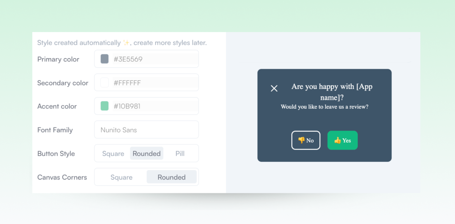
Incorporate your brand's fonts and colors into unique styles that govern your in-app patterns.
Adjust the look of any visual component, control spacing or padding, and define global styles that you can easily apply to any in-app pattern.
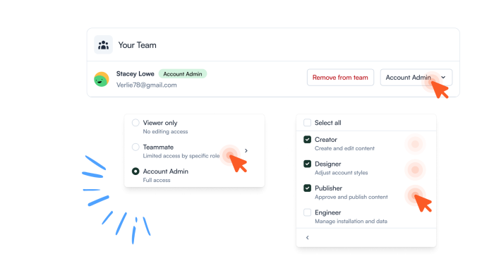
Use custom icon triggers or widgets to ensure every element matches your design standards for a better user experience.
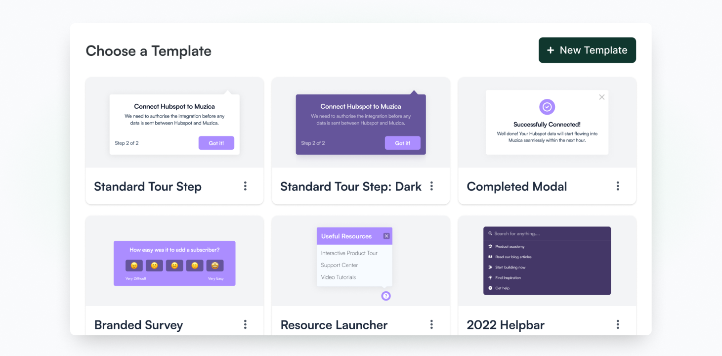
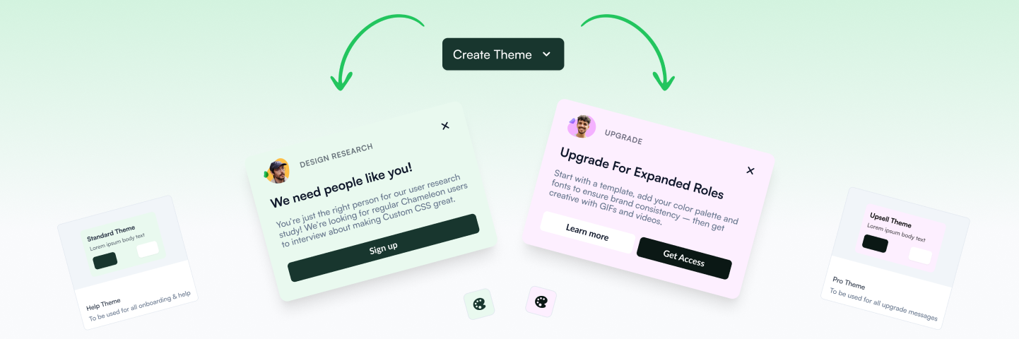
Create blueprints for various user flows that anyone on your team can reuse to jump into building a new pattern.
“A big reason why we were blocked in the past from purchasing a solution like this was that we wanted our in-app experiences to look like they were part of our app.”
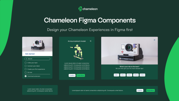
Use the Figma Components file to establish your in-app style before implementing your Themes or making updates.
Collaborate seamlessly with your team, review changes before publishing, and adapt the styles based on users’ profiles.

Design welcoming experiences with progress bars, checklist visuals, and celebratory animations.
Product Designers can create a unified style that reflects your brand with each interaction in-app. Customize every detail to match your brand's look and deliver experiences that captivate users and elevate your product's impact.


“Chameleon is very flexible, dynamic to our application, and it looks native.”
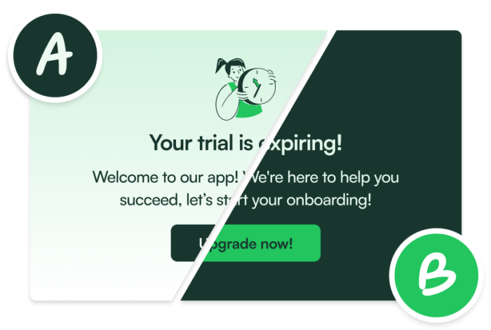
Launch A/B Tests on Tours or Banners to know what works best with your in-app patterns
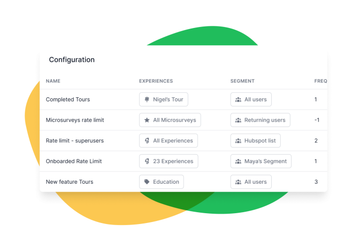
Set the right pace for in-app guidance and avoid overwhelming users

Create recorded journeys that users can launch to run automatic tasks or flows in your platform
Get started free in our sandbox or book a personalized call with our product experts