


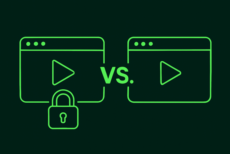
Apple's new Liquid Glass design language landed at WWDC 2025, and the design community immediately split into two camps: those calling it the future of interfaces and those calling it an accessibility nightmare. They're both right. But the real story isn't about translucent buttons…
Whether you think it’s Windows Vista reincarnated, or you’re in love with the crystal clear apps, this is way more than just another UI trend. It’s not just a pretty interface. It’s a looking glass into the future of software.
And in the Product world, that gets interesting. When Apple introduces a design paradigm, it doesn't just influence iOS apps. It shifts user expectations. Remember the great skeuomorphism exodus of 2013? Or when every app suddenly needed a dark mode? This could be one of those inflection points.
What is Liquid Glass all about?
Liquid Glass is context-aware. Unlike the flat cards in your current design system, it actually pays attention to its surroundings. For SaaS, think models that don't completely disconnect users from their workflow or upgrade prompts that maintain a visual connection to the feature they're upselling.
It even feels faster (but only because it tricks your brain)
Here’s the clever bit: translucent overlays feel lighter and quicker, even when they’re not. The wait time is shorter because your brain stays anchored to what’s behind them.
That’s not just design—it’s psychology. And for data-heavy products that make users wait (you know who you are), this trick buys you goodwill without changing your loading times.
So what does it do?
Dynamic translucency that adapts to background content
Layered depth created through blur, shadow, and light
Ambient awareness that makes UI feel placed, not pasted
The translation for product teams is that they're preparing users for interfaces that exist in physical space, not just on screens. You’re designing for rooms, for light, for movement. Give it a few years, and your app might soon be floating in someone's living room.
Welcome to spatial UX. You’re already in it.
Why Apple is shifting to Liquid Glass
This isn't a random design choice about what Apple thinks is trendy. Apple's making three calculated bets:
1. The AR era is coming sooner than we think
They're essentially conducting a massive user research experiment. By normalizing translucent, spatially aware interfaces, they're reducing the learning curve for future AR experiences. Whenever you interact with a Liquid Glass notification, you're trained to parse layered digital information in physical space. When Apple ships its AR glasses in 2027 (allegedly), a billion users will already understand the visual language. It's brilliant behavioral design at platform scale.
2. Delightful differentiation works
Pull up your favorite SaaS apps. If you removed the logos and colors, could you tell Asana from Monday.com? Jira from Linear? Most B2B products have converged on the same Material Design-inspired aesthetic. Liquid Glass is Apple's declaration that, in mature markets, emotional design is the differentiator. While everyone else optimizes for familiarity and "best practices," Apple optimizes for feeling. And feelings drive upgrades, retention, and – crucially, pricing power.
3. Performance is a feature
Only devices with M-series chips or A17+ can render these effects. But here's the strategic angle: by making beautiful interfaces computationally expensive, Apple creates a two-tier experience. Sure, your three-year-old iPhone still works, but it doesn't feel premium anymore. It's the same playbook luxury car makers use – the base model runs fine, but the ambient lighting and heated seats remind you what you're missing. For SaaS products, this translates to: Can you create experiences that scale gracefully from basic to beautiful?
The big problem with Liquid Glass
Liquid Glass is an accessibility minefield. If you're considering implementing it, you need to understand these tradeoffs before your design team falls in love with the aesthetic.
The contrast problem is worse than you think
WCAG 2.1 requires a 4.5:1 contrast for standard text. With translucent overlays, you're not calculating against one background but against infinite possible backgrounds. Dynamic contrast adjustment sounds clever until you implement it: text that shifts colors mid-sentence, performance tanks from real-time calculations, and edge cases everywhere 🥴
There’s a big problem with cognitive load
For neurodivergent users, the visual complexity can be overwhelming. What feels delightfully ambient to some users feels distractingly busy to others. The same ambient effects designed to make interfaces feel effortless and intuitive demand more cognitive resources to parse. It's the UI equivalent of whispering at a loud dinner party, technically softer but much harder to understand.
Performance tax is real
A backdrop filter is expensive. You need graceful degradation on older devices or with reduced motion settings. Most teams don't think about this until it's too late. While an M3 MacBook purrs through those buttery animations, your Enterprise customers on old Dell laptops will endure slideshow-level frame rates and a computer that could double as a space heater.
Liquid Glass isn't a design system; it's a power tool. Use it sparingly for high-impact moments (e.g., onboarding wins, upgrades, celebrations) where delight outweighs efficiency, and always with an opaque fallback.
How to recreate Apple’s Liquid Glass in your product with Chameleon
Keen to pour some Liquid Glass into your product? The easiest way to start is by using Chameleon.
Our Custom CSS feature lets you do whatever you want style-wise to your in-app campaigns (product tours, modals, banners, etc.). Copy this CSS cheatcode to follow Apple’s trend:
Follow this interactive demo to add it to your in-app campaign. You'll need a free Chameleon account.
Top places to try Liquid Glass in your product
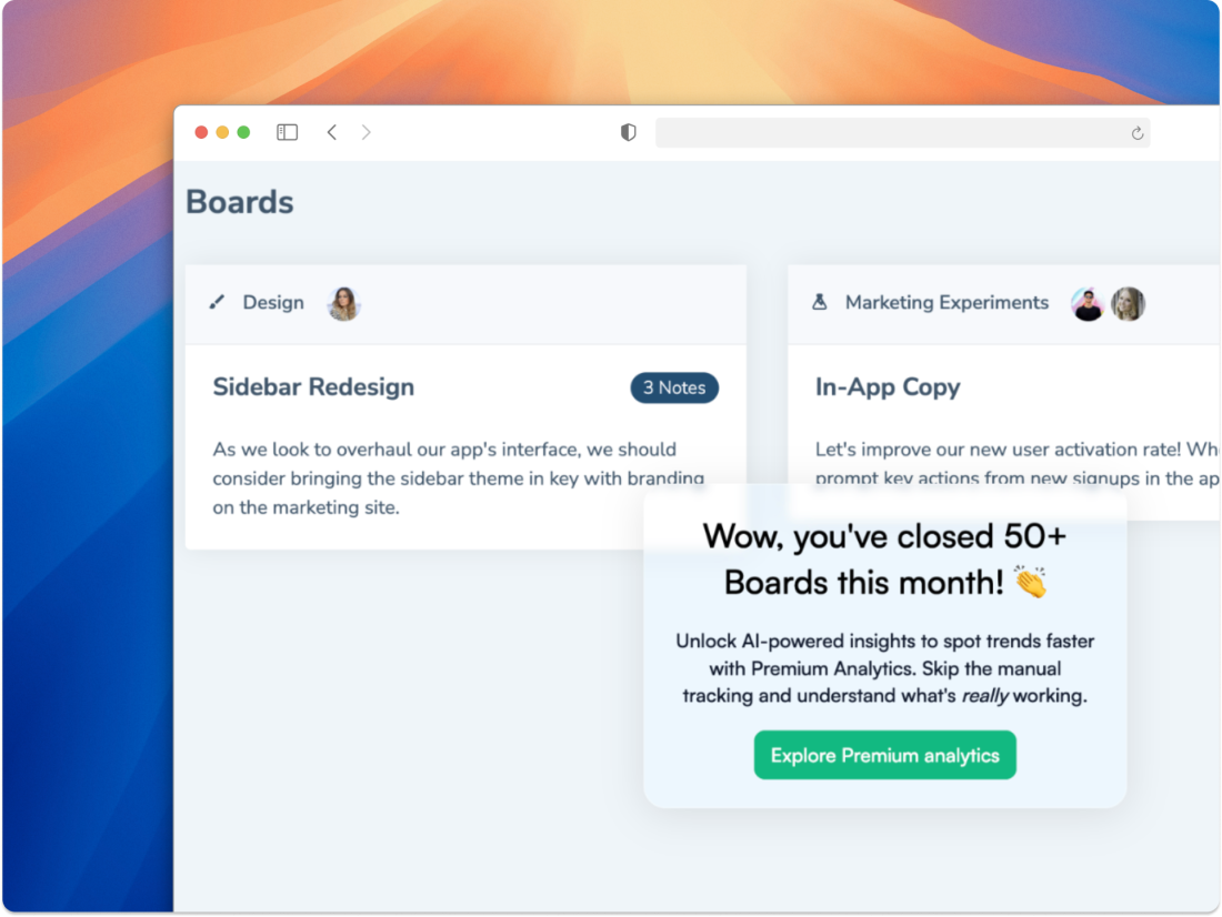
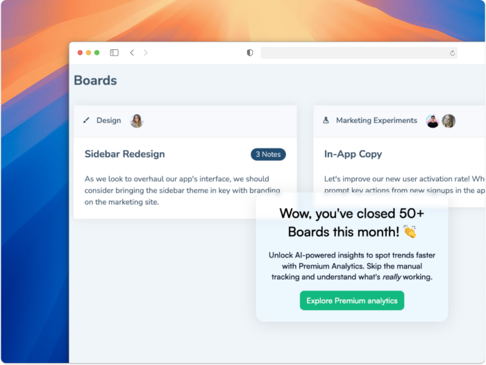
User onboarding tours and modals: The translucency reduces the cognitive jump between onboarding advice and your app beneath the onboarding layer. Plus, that premium first impression during onboarding can justify the performance cost when you're actively trying to “wow” new users.
Feature announcements: Liquid Glass feels novel and can help you break through modal fatigue. It raises your voice through design so that users interact with your updates. It’s a nice surprise for users that will make them stop in their tracks and engage without being in their face. Try a slide-out for this with some buttery smooth animations, too.
Upsell opportunities: Premium features demand a premium UI. Use some Liquid Glass when users hit plan limits or discover locked features. The premium aesthetic reinforces what they're missing. The key is timing: trigger these when users succeed (just completed a workflow, achieved a milestone), not when they're frustrated by limitations. Success states make users more receptive to premium positioning.
Moments of celebration: When users hit meaningful milestones like completing the 100th task, achieving a team goal, or renewing their annual subscription, Liquid Glass effects make the celebration feel special without being cheesy. Plus, it's cheaper than sending everyone SaaSy socks with your logo.
Where it absolutely doesn't work
Data-dense UI: Tables and dashboards need clarity, not ambiance. Adding translucency to your analytics is like reading a spreadsheet with dirty glasses. Your data should communicate insights, not win design awards.
Technical or form-heavy workflows: Every translucent form field is a conversion killer. Users configuring APIs or filing expense reports need boring, opaque clarity; save the pretty for after they hit submit.
Text-heavy areas: Docs, help content, any text over ~three sentences, keep it opaque. Your knowledge base isn't a mood board; users need to focus on the words, not the design.
Should you add Liquid Glass to your product?
Honestly, it depends. And it isn’t something you should roll out to your entire product overnight. If you’re using a tool like Chameleon, you can test this in your in-app campaigns without touching your core product code.
Try Liquid Glass if:
Your users are tech-savvy
Design aesthetics = competitive advantage
You can dedicate time to proper accessibility testing
You can A/B test to measure the real impact on engagement
Skip it if:
Your users are on older devices or are digitally lagging
Task completion speed is your north star metric
You can't invest in full accessibility compliance
Chameleon helps you speed up the testing here. You can run controlled experiments without engineering resources since you're adding CSS to experiences rather than your product codebase. Start with one announcement modal, measure engagement lift through an A/B test, then decide if it's worth broader implementation. If it fails? Roll it back instantly.
To Liquid Glass, or let it pass?
Liquid Glass simultaneously offers a glimpse of the future and a potential accessibility nightmare. It's beautiful and problematic, innovative and exclusionary. Welcome to modern product design, where every decision involves navigating these contradictions.
Remember: the goal isn't to be the first to implement Apple's latest innovation. It's to evolve your product to serve your specific users thoughtfully.
Choose wisely 🔮
Launch futuristic user onboarding with Chameleon
Make every in-app experience feel tailor-made with native-feeling, AI-enhanced patterns

